
Why Color Choice Transforms Your Kitchen Experience
Kitchen design color schemes are the foundation of creating a space that truly reflects your personality and meets your daily needs. Whether you’re drawn to calming blues, energizing yellows, or sophisticated dark tones, the right color palette can completely transform how your kitchen feels and functions.
Popular Kitchen Color Schemes:
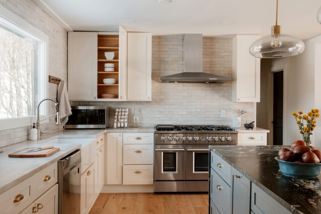
- Classic White & Gray – Timeless, clean, and versatile
- Navy Blue & Brass – Sophisticated with coastal charm
- Sage Green & Natural Wood – Earthy and calming
- Black & White – Bold contrast with modern appeal
- Warm Neutrals – Beige, cream, and soft browns for coziness
Gone are the days when white was your only safe option. Today’s homeowners are embracing bold colors that make their kitchens the true heart of the home. As one interior design mentor wisely said, “There are no bad colors, just bad color combinations.”
Color affects more than just looks. It influences how spacious your kitchen feels, the mood it creates, and even how much you enjoy cooking. Light colors like white and cream make small spaces feel larger by reflecting natural light. Dark colors like navy and forest green create cozy, intimate atmospheres perfect for entertaining.
The key is understanding how different hues work together with your existing materials – from countertops to flooring to natural light. With the right approach, you can create a kitchen that’s both beautiful and perfectly suited to your Orlando lifestyle.
 on left side labeled \"Energizing & Stimulating\" and cool colors (blues, greens, purples) on right side labeled \"Calming & Soothing\" with examples of how each affects kitchen mood and perceived space - Kitchen design color schemes infographic")
Important Kitchen design color schemes terms:
The Psychology of Kitchen Colors: Setting the Mood
Have you ever walked into a kitchen and instantly felt energized? Or maybe you’ve experienced that sense of calm that washes over you in certain spaces? That’s the magic of color psychology at work, and it’s exactly why choosing the right kitchen design color schemes goes far beyond what simply looks pretty.
Color theory might sound fancy, but it’s really quite simple. Think of colors as having personalities. Warm colors like reds, oranges, and yellows are the extroverts of the color world. They’re stimulating, appetizing, and love to make a big kitchen feel more intimate and cozy. Cool colors like blues, greens, and purples are more like the calm, collected friend who helps everyone relax. They’re naturally soothing and can make your kitchen feel more spacious and serene.
Here’s where things get really interesting: colors can actually trick your eyes about space. Light colors are master magicians when it comes to making rooms feel bigger. White, cream, and soft grays bounce light around like tiny mirrors, creating that airy, open feeling that makes even a compact kitchen breathe easier. Dark colors do the opposite – they absorb light and pull walls in closer, creating that cozy, intimate vibe that’s perfect for large spaces that might otherwise feel too vast.
But the real power of color lies in its emotional impact. Picture a sunny yellow kitchen – doesn’t it just make you smile? Yellow naturally boosts mood and energy, making morning coffee feel like a celebration. Blue kitchens bring that ocean-calm feeling indoors, perfect for busy families who need a peaceful retreat. And green? It’s like bringing a bit of nature inside, promoting feelings of health and tranquility that make cooking feel more grounding.
How Color Impacts Your Kitchen’s Feel
The secret sauce to successful kitchen design color schemes is understanding how light and color dance together. Light reflection is your best friend when creating the perfect atmosphere. Colors don’t just sit there looking pretty – they actively bounce natural and artificial light around your space, completely changing how bright and spacious everything feels.
If your kitchen gets plenty of natural light streaming through windows, you can be bold with darker, richer colors without worrying about creating a cave-like feeling. But if your kitchen is on the shadier side, lighter colors become your allies, helping amplify whatever light you do have.
This is where personal expression really shines. Want a high-energy space where family gatherings buzz with excitement and culinary trips unfold? Warm, stimulating colors like vibrant reds or cheerful oranges might be calling your name. Dreaming of relaxing environments where you can unwind with a cup of tea and cook in peaceful quiet? Soft sage greens or calming powder blues could be perfect.
The key is matching your color choices to how you actually live. Your kitchen should feel like you, supporting the moments and memories you want to create there. For more inspiration on maximizing your space’s natural beauty, check out A guide to natural light in your home.
Dark vs. Light Palettes: Pros and Cons
Choosing between dark and light kitchen design color schemes is one of those delightful design dilemmas where both options offer something special. Let’s break down what each brings to the table.
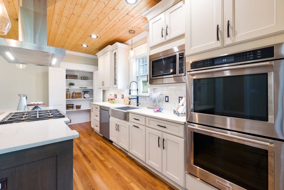
Light palettes – think whites, creams, and soft grays – are the champions of creating that airy and open feel. They’re natural light amplifiers, making even the smallest kitchen feel more spacious and bright. There’s something undeniably fresh and clean about an all-white kitchen that feels both timeless and versatile. You can layer in textures, add pops of color, and change your style without fighting your backdrop.
But here’s the honest truth about light colors: they can sometimes feel a bit sterile if you don’t add warmth through textures and materials. And yes, they do show every little spill and smudge, which means a bit more maintenance and cleaning in a busy household.
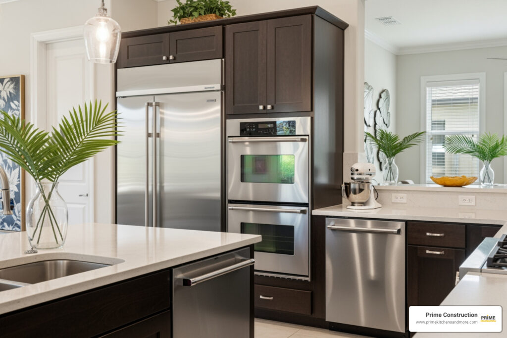
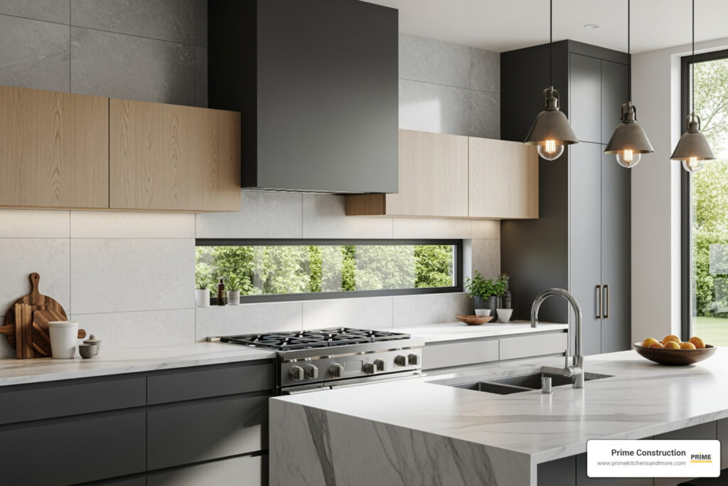
Dark palettes – gorgeous navies, rich forest greens, dramatic blacks – create an entirely different magic. They wrap your kitchen in a cozy and dramatic mood that feels sophisticated and grounding. Dark colors are fantastic at hiding imperfections like minor scratches or everyday wear, making them surprisingly practical for busy families. Plus, they make bold statements that show off your confident style.
The flip side? Dark colors can make spaces feel smaller and might require more thoughtful lighting to avoid that closed-in feeling. But when done right, they create some of the most stunning and memorable kitchens you’ll ever see.
The beauty is that you don’t have to choose just one approach. Many of today’s most successful kitchen designs blend light and dark elements, creating depth and visual interest that gives you the best of both worlds.
Trending Kitchen Design Color Schemes for 2024

This year is bringing some truly exciting changes to kitchen design color schemes. While classic white kitchens aren’t going anywhere (they’re still loved for good reason!), homeowners are getting braver with their color choices. We’re seeing a beautiful shift toward palettes that tell a story and reflect personality.
The big news for 2024? Statement colors are having their moment. Think navy blue that makes you feel like you’re sailing on calm waters, forest green that brings the outdoors in, and even bold clay reds and rich plums. It’s like kitchens are finally getting permission to show some personality.
This section will explore a variety of palettes to inspire your next project, from earthy and natural to bold and dramatic. Whether you’re drawn to colors that whisper or ones that shout, there’s something here for every style.
Earthy & Grounded Palettes
There’s something magical about colors that make you feel connected to nature. These earthy kitchen design color schemes create kitchens that feel like a warm hug – welcoming, peaceful, and utterly comfortable.
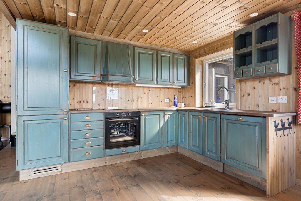
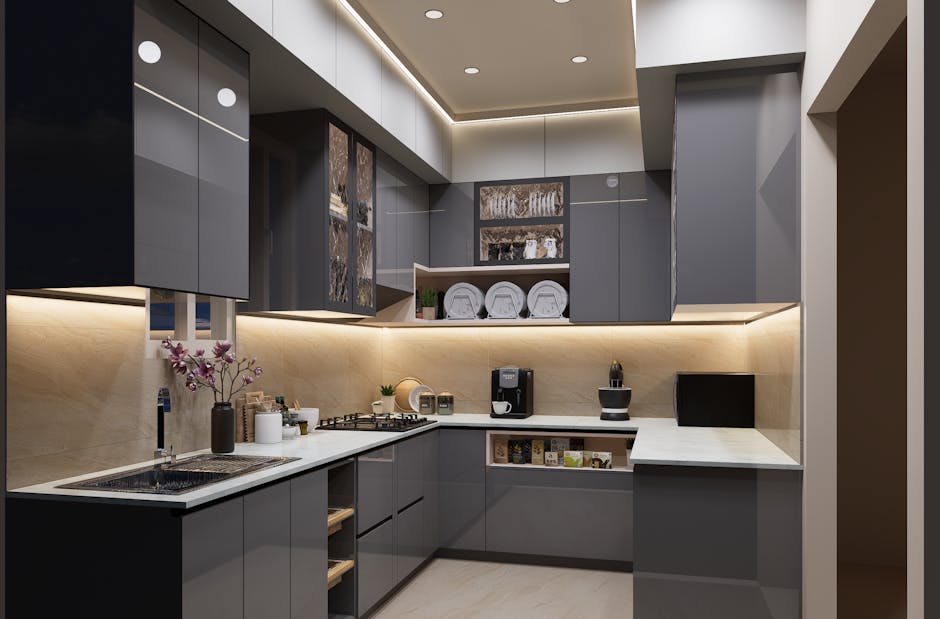
Sage Green & Onyx Black is leading the charge in sophisticated natural palettes. Picture smoky green cabinets paired with a dramatic onyx black island. The contrast is stunning, especially when you add velvet bar stools and sleek gold hardware. show just how neat this combination can be.
Rich Brown & Stone combinations are making brown cool again (and about time!). These aren’t your grandmother’s honey oak cabinets. We’re talking rich, chocolate brown stains that look luxurious against natural stone countertops. Add some wicker bar stools, and you’ve got a kitchen that feels both refined and refreshingly down-to-earth.
Wood tones are having a major comeback too. The trend is moving away from everything being painted to celebrating natural wood grain. Mixing dark and light wood creates incredible depth – imagine a distressed blonde wood island against dark wood ceiling beams. It’s like bringing a forest cabin into the 21st century.
Terracotta & Cream brings warmth that feels both modern and timeless. Terracotta tiles can add that perfect rustic touch, while creamy white elements keep everything feeling fresh. This palette makes you want to bake bread and invite friends over for long dinners.
Bold & Dramatic Combinations

Ready to make a statement? These bold kitchen design color schemes are for homeowners who want their kitchens to be conversation starters. These aren’t wallflower colors – they’re confident, dramatic, and absolutely gorgeous.
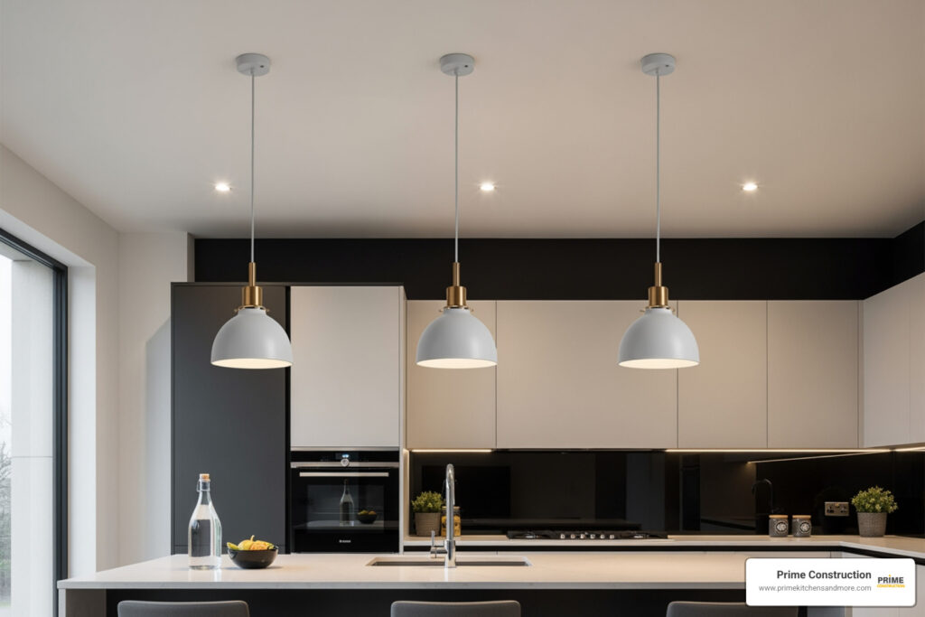
Navy Blue & Crisp White remains a favorite for good reason. There’s something about navy that feels both classic and fresh. Navy cabinets with white countertops and brass hardware create a look that’s sophisticated without being stuffy. It’s like wearing a perfectly custom navy blazer – always appropriate, always stylish.
Moody Black & Natural Wood creates drama that’s surprisingly livable. Deep black cabinets might sound intimidating, but when you balance them with warm wood accents, the result is sophisticated and cozy. It’s bold enough to make a statement but warm enough to feel like home.
Emerald Green & Gold is pure luxury. This jewel-toned combination feels rich and neat, especially against white tile backsplashes. The green brings nature’s calm while the gold adds just the right amount of glamour. It’s like having a piece of fine jewelry in your kitchen.
Wine lovers, this one’s for you: Wine Red & Brass Accents brings warmth and richness that’s impossible to ignore. can transform your kitchen into something truly special. Add brass hardware, and you’ve got a space that feels both bold and inviting.
Soft & Serene Hues
Sometimes you want your kitchen to be a peaceful retreat from the world. These gentle kitchen design color schemes create spaces that feel calm, soothing, and utterly relaxing.
Powder Blue & Walnut creates a combination that’s both cool and warm. The soft blue feels like a gentle breeze, while rich walnut wood keeps everything grounded. Add gold hardware, and you’ve got sophistication with a soft touch.
Creamy Off-White & Gold Fixtures proves that neutral doesn’t have to mean boring. This palette feels luxurious and timeless, especially with marble countertops. It’s like wrapping your kitchen in cashmere – soft, neat, and endlessly comfortable.
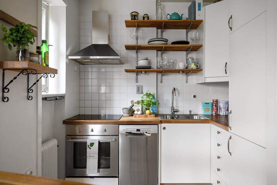
Light Gray & White continues to be a favorite because it just works. This combination reflects natural light beautifully, making even small kitchens feel spacious and bright. It’s the perfect backdrop for adding personality through accessories and textures.
The world of muted pastels is expanding beyond traditional choices. Think cloudy blues, muddy greens, and creamy beiges that feel inspired by nature. Even unexpected choices like baby pink with gray and white or mint green with soft peach are finding their way into kitchens. These gentle colors create harmony without overwhelming your senses.
How to Choose and Apply Your Perfect Palette

Selecting the perfect kitchen design color schemes feels overwhelming at first, but it doesn’t have to be. Think of it as creating a recipe – you need the right ingredients in the right proportions to make something truly delicious. At Prime Kitchens And More LLC here in Orlando, we’ve helped countless families steer this exciting journey, and we’ve learned that the best kitchens happen when you balance what you love with what actually works.
Start by taking a good look around your current space. What’s staying? Your beautiful granite countertops, that gorgeous hardwood floor, or those stainless steel appliances you just bought? These existing elements are like the foundation of your house – everything else needs to play nicely with them. If you have warm honey oak floors, cool gray cabinets might create a stunning modern contrast, while creamy whites could give you that seamless, flowing feel.
Here’s where many people stumble: testing colors is absolutely essential. Those tiny paint chips at the store are liars – they never show you the whole truth. Get large samples and tape them right on your walls or cabinet doors. Watch them throughout the day as the light changes. That gorgeous sage green that looked perfect under the store’s fluorescent lights might turn muddy in your north-facing kitchen, or that crisp white might feel too stark in your cozy breakfast nook.
The magic happens when you see colors in your actual space, with your actual lighting, next to your actual stuff. Trust us – this one step prevents more regrets than anything else we could tell you.
Mastering Color in Small Kitchens
Small kitchens are like puzzles – every choice matters more, but the payoff can be incredible. The good news? Kitchen design color schemes can actually make your compact space feel much larger and more inviting than you’d think possible.
Light colors are your secret weapon here. White, cream, and soft grays bounce light around like tiny mirrors, instantly opening up the space. It’s not magic – it’s just smart physics. But don’t think you’re stuck with boring neutrals forever.
Monochromatic schemes can work wonders in small spaces, even with darker colors. Picture this: an all-gray kitchen with different shades and textures throughout. The seamless flow reduces visual clutter, making the space feel bigger and more sophisticated. Your eye doesn’t get confused by competing colors, so the room feels calmer and more spacious.
For high-contrast combinations, think navy and white or black and cream. These bold pairings can actually help define your small kitchen within an open floor plan. The contrast creates visual boundaries without building actual walls, giving you distinct zones in your limited space.
Two-tone cabinets are particularly clever in small kitchens. Try light colors on your upper cabinets to draw the eye upward, making your ceiling feel higher. Pair them with slightly darker lowers for grounding. This trick makes your kitchen feel taller and more balanced, even in the tightest spaces.
The Art of the Accent: Using Bold Colors Wisely
Want to add personality without going overboard? The secret is knowing where to put your bold colors for maximum impact. Think of it like seasoning a dish – a little in the right place makes all the difference.
The 60-30-10 rule is your friend here. Use your main neutral color for about 60% of the space (walls, most cabinets), a secondary color for 30% (maybe an island or lower cabinets), and save that gorgeous bold accent for just 10% (backsplash, accessories, or open shelving displays). This keeps everything balanced while letting your personality shine through.
Kitchen islands are perfect for bold color statements. A vibrant blue island in an otherwise neutral kitchen becomes an instant conversation starter. It’s like having a beautiful piece of furniture that also happens to be incredibly functional.
Lower cabinets in a bold color can ground your space beautifully, especially when topped with lighter uppers. This creates visual weight at the bottom while keeping things feeling open above. Backsplashes offer another fantastic opportunity – they’re big enough to make a statement but small enough to change if you get tired of the color.
In open-plan layouts, strategic color placement helps define different zones without walls. A colorful accent wall behind your stove or a boldly painted island can separate your cooking area from your dining space, creating organization in an open flow.
Balancing Your Kitchen Design Color Schemes with Materials
Colors never exist in a vacuum – they live alongside your countertops, floors, hardware, and all the other materials that make your kitchen functional and beautiful. Getting this balance right is what separates a good kitchen from a truly stunning one.
Natural wood tones bring warmth and life to any kitchen design color schemes. Whether you choose light blonde woods or rich walnut, wood adds an organic element that makes colors feel more grounded and livable. Wood works with almost everything – it can warm up cool grays or add richness to earthy greens.
Stone countertops like marble, granite, and quartz aren’t just work surfaces – they’re design elements with their own colors and patterns. Those subtle veins in your marble or the flecks in your granite can inspire your entire color palette. Smart designers often start with the stone and build the color scheme around it.
Metallic finishes add the jewelry to your kitchen. Gold hardware brings warmth and luxury, especially beautiful against navy or forest green cabinets. Copper accents pair wonderfully with earthy tones, while stainless steel keeps things sleek and modern with contemporary colors.
Your backsplash tile ties everything together. From classic subway tile to intricate mosaics, this is where texture meets color. A patterned tile can echo colors from throughout your kitchen, creating that pulled-together look that makes everything feel intentional.
The secret is choosing materials that support your color story rather than competing with it. When everything works together, your kitchen feels cohesive and thoughtfully designed – exactly what you want in the heart of your home.
Frequently Asked Questions about Kitchen Colors
What is the most popular color for a kitchen?
White has been the reigning champion of kitchen colors for decades, and it’s easy to see why. This classic choice creates a bright, clean look that feels timeless and welcoming. White kitchens work beautifully with any style – from farmhouse charm to sleek modern designs – and they’re incredibly appealing to home buyers because they offer a blank canvas for personal touches.
But here’s what’s exciting about 2024: we’re seeing homeowners break free from the all-white tradition! While kitchen design color schemes still often include white as a foundation, people are adding bold personality with earthy greens, deep blues, rich browns, and even moody blacks. These dramatic colors create kitchens that feel more personalized and expressive.
At Prime Kitchens And More LLC, we’ve noticed Orlando homeowners are particularly drawn to statement colors like navy blue, forest green, and terracotta. These choices reflect a desire for kitchens that truly stand out and express individual personality rather than playing it safe.
What colors make a kitchen look bigger?
If you’re working with a smaller kitchen, light and neutral colors are your secret weapons for creating the illusion of space. White, cream, light gray, and soft pastels work like magic by reflecting both natural and artificial light around the room, making everything feel more open and airy.
The science behind this is simple: light colors bounce light around, while dark colors absorb it. So when you paint your cabinets in a soft cream or pale gray, you’re essentially turning them into light reflectors that make your kitchen feel larger than it actually is.
Muted colors like sage green or powder blue can also work wonderfully in small spaces. They add personality without overwhelming the room. For the most expansive feel, consider a monochromatic scheme using different shades of the same light color – this reduces visual clutter and creates a seamless flow that tricks the eye into seeing more space.
What are common mistakes to avoid when choosing kitchen colors?
Choosing the perfect kitchen design color schemes can feel overwhelming, but knowing these common pitfalls will save you from costly regrets.
The biggest mistake we see? Forgetting to test paint colors in your actual kitchen lighting. That gorgeous navy blue you loved at the paint store might look completely different under your kitchen’s specific lighting conditions. Always paint large swatches on your walls and observe them throughout the day – morning light, afternoon sun, and evening artificial lighting can all make colors appear dramatically different.
Another frequent oversight is ignoring existing elements like your flooring, countertops, and appliances. Your new color scheme needs to play nicely with these permanent fixtures. If your granite has warm undertones, choosing a paint color with cool undertones might create an awkward clash.
Don’t fall into the trap of choosing a trend that doesn’t match your personality. While those bold emerald green cabinets might be Instagram-worthy, ask yourself: will you still love them in five years? Your kitchen should reflect your style, not just what’s popular right now.
Consider the overall mood of your home too. Your kitchen doesn’t exist in a vacuum – it needs to flow well with adjacent rooms, especially in open floor plans. A jarring color transition between spaces can make your home feel disjointed.
Finally, be cautious about using dark colors in small, low-light kitchens. While dramatic blacks and deep blues can be stunning, they absorb light and can make cramped spaces feel even smaller. If you love dark colors, balance them with plenty of white or light elements to maintain brightness and openness.
Conclusion
Choosing the right kitchen design color schemes is truly one of the most rewarding parts of creating your dream kitchen. Throughout this guide, we’ve finded that color is so much more than just picking what looks pretty – it’s about crafting a space that makes you feel at home every single day.
Whether you’re drawn to the timeless elegance of crisp whites, the earthy warmth of sage greens, or the bold sophistication of navy blues, your color choices will shape how your kitchen feels and functions. We’ve seen how light colors can make even the smallest Orlando kitchen feel spacious and airy, while darker tones create that cozy, intimate atmosphere perfect for family gatherings and entertaining friends.
The beauty of today’s design trends is that there really are no rules anymore. Gone are the days when you had to play it safe with all-white everything. Your kitchen should tell your story – maybe that’s through the calming blues that remind you of Florida’s beautiful coastline, or perhaps it’s the rich terracotta tones that make you think of Mediterranean evenings.
Remember the practical tips we’ve covered: always test those paint swatches in your actual lighting, consider your existing materials like countertops and flooring, and don’t be afraid to use the 60-30-10 rule to balance bold colors with neutrals. These simple strategies can save you from costly mistakes and ensure your final result is exactly what you envisioned.
The most important thing is that your kitchen reflects you. After all, this is where you’ll start your mornings with coffee, where your kids will do homework at the island, and where you’ll create countless memories with family and friends. The right colors will make all of these moments feel even more special.
For homeowners throughout Orlando and the surrounding areas – from Winter Park to Kissimmee, from Windermere to Apopka – Prime Kitchens And More LLC is here to help transform your vision into reality. With our 15 years of experience in kitchen design and remodeling, we understand how to balance beautiful aesthetics with practical functionality. We work with premium materials and take pride in ensuring every detail reflects your personal style.
Ready to start your kitchen change journey? Explore our construction services to start your dream kitchen remodel and let’s create a space you’ll love for years to come.